Improve Access To Key Project And Resource KPI’s Using OpenAir Graphical Dashboards
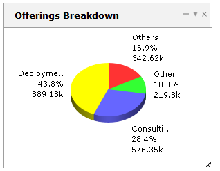
Did you ever hear the saying “a picture is worth a thousand words”? It’s true, especially in the case of financial data viewing and critical metrics used to run your organization. OpenAir supports customizable graphical dashboards that display your already configured OpenAir reports in a variety of graphing styles.
To use a graphical dashboard, you must be on the latest User Interface which has an in-tab menu including the creation of new items via the in-tab menu. If you see a ‘Create…’ tab in your modules, you will need to upgrade your User Interface.
CAUTION: Moving to in-tab item creation is just enough of a change to impact all users in your system. Please make sure you inform them prior to and after the switch to reduce help desk questions.
To setup a dashboard:
- Ensure your role has ‘View Dashboard Graphs’ enabled (check w/ your system admin)
- Navigate to the Home or Dashboard module and the Dashboard tab
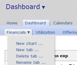
- Within the Dashboard tab, select the in-tab menu and ‘new graph’ option
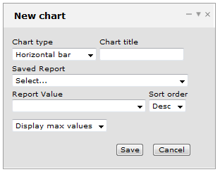
4) Complete the dashboard definition form:
- Graph type: line, pie, horizontal bar, vertical bar, horizontal multi-bar, vertical multi-bar
- Identify a graph name (it will default to the report name if left blank)
- Select the report from which the graph will display data (the report must be one you own or be shared to you)
- Select the desired values to display in graphical form
- Select the maximum or top X values to display in the graph
- Save
5) You also have the ability to create multiple dashboard tabs to organize your graphs by type such as Financials, Utilization, Strategic Offerings, etc.
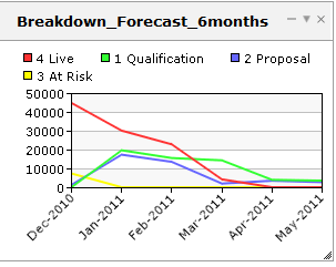
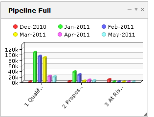
A few examples…

