Four Methods for Viewing Schedules in OpenAir
There are four methods available in OpenAir for viewing schedules outside of running reports. The first is the calendar view. This can be found in the Home or Dashboard module and made available as a ‘My Calendar’ tab throughout the application.
If you have longer term projects, this can be a very helpful view. By selecting to display only schedule requests, you can create a vacation calendar for your organization provided schedule requests are used as part of the vacation process. The calendar view, however, may not be the most useful view for companies with people working on numerous projects during the week as it can be difficult to view information in the formatted calendar space.
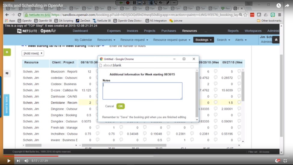
The second view is the worksheet bookings view, found in the Resources module, which essentially displays bookings data in a web format similar to a spreadsheet. This view can be helpful for viewing and maintaining someone’s bookings on specific projects or by viewing teams scheduled on specific projects. If you are entering booked hours, this view can be pretty handy. It has pop-up notes next to each hour entry cell where you can add other relevant information (as demonstrated in the image below). With this view you can use settings to filter to individual users, clients, and/or projects as desired.

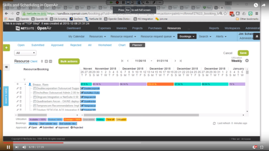
The third view is the bookings planner view. It shows all users and all projects a resource is scheduled to work along with availability. Each scheduled project is represented by a colored bar for the duration of the booking, color-coded by booking type (depending on setup). The user row is a roll-up of all scheduled project time with an interpretation of utilization including color-coding for over-utilized or under-utilized resources. Column filtering, for columns as configured in your list view, and Advanced column filtering is available to locate individuals by various fields and manage information. Scheduled project time bars may be drag-n-dropped to other users for reassignment or edited inline for adjusting scheduled hours.

The last view is the bookings chart which gives you the ability to see view a schedule graphically by time periods. You can set it up to show each time period bar as hours or as the percentage of time that is booked. You can also see who is overbooked by color-coding if using the booked vs. overage chart view or by arrow-symbols at the top each bar if using other chart view options. This view is great to quickly glance at how busy people are. Advanced and time period filters are available at the chart view level to quickly adjust your information display. By hovering over each bar, a pop-up window can optionally be configured to display information about the project and the booking in general.
To learn more about utilizing these views in OpenAir, checkout the recorded webinar “Skills and Scheduling in OpenAir” webinar on the TOP Step Consulting website.
