Dashboarding Rows vs. Columns in OpenAir
Ever use trial and error to see how you can display your OpenAir report in Dashboard form? Here’s a tip that can help you get columns to display instead of rows from a report when using lines or multiple bar graphs.
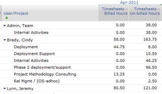
Dashboards in OpenAir rely on reports being configured. When using summary reports, the information is organized by rows grouped in some manner and columns displaying field values across time. Let’s use a utilization report, for example, that shows a list of users with projects they worked on last month and the billable hours vs. nonbillable hours.

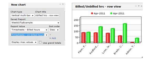
By using a Vertical Multi-bar graph and showing billed hours / un-billed hours, you get a breakdown by user for the month on the x axis, but the legend reflects only the time index. The name of the report is the best way to interpret the columns of information. I call this the row view since the X axis has the user names and the single index month of columns is used to drive the bars (billed/unbilled).

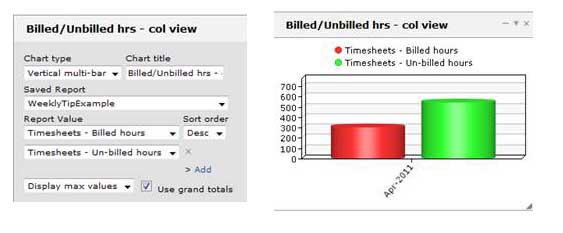
By checking the ‘use grand totals’, you can see how the legend and display changes to be column focused instead. The X axis converts to the time dimension. The Grand Total option ignores the subtotal row but converts the legend to be the columns of information.

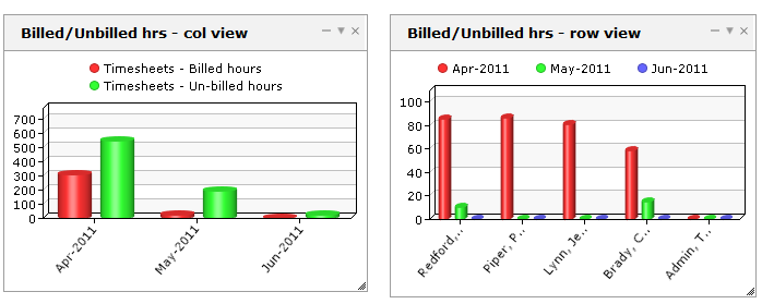
Expanding this report into multiple months shows how much more readable it is with grand totals than user level – and the user level drops the unbilled hours value since the legend can only accommodate one index (billed hours in this case, instead of 1 month in the last example).

By using report filtering, however, you can easily create dashboards that focus on groups of people (or even directly individuals, if necessary!)
